doublesoul
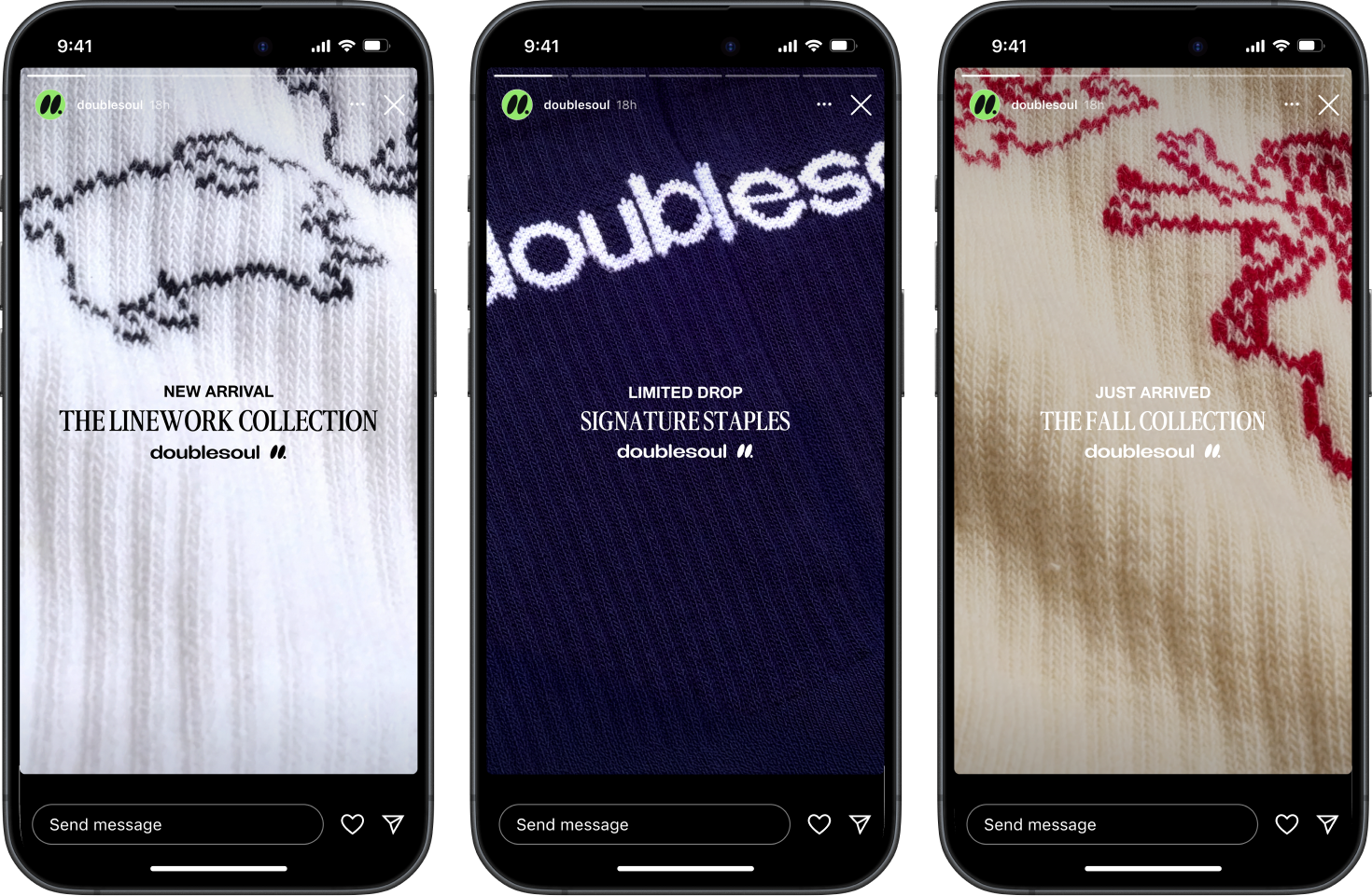
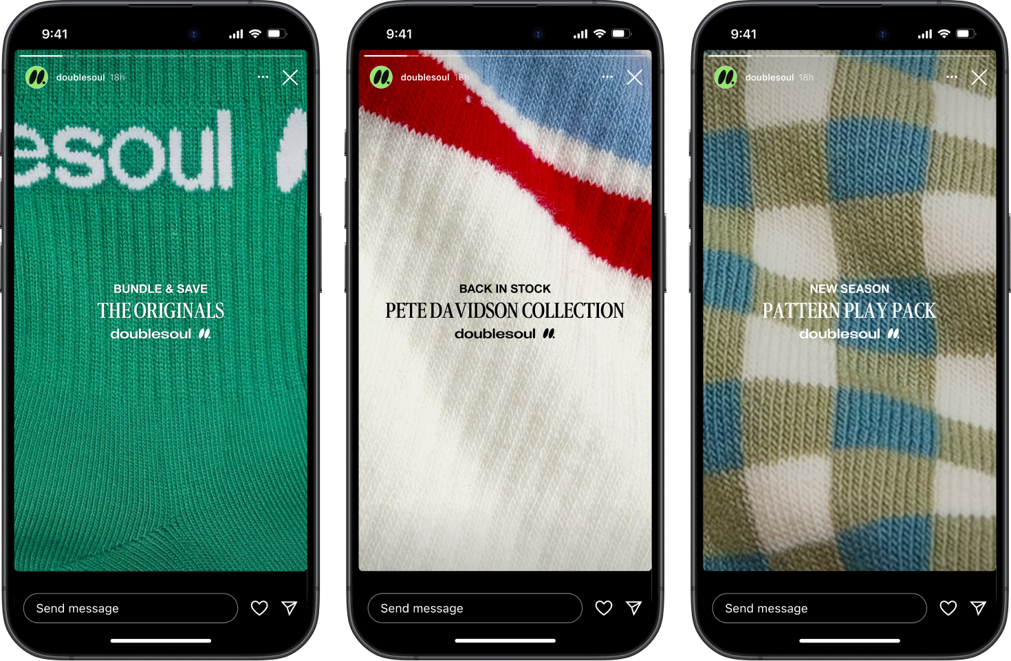
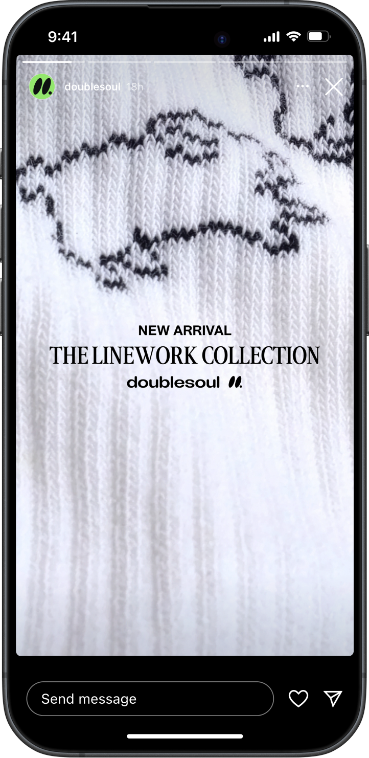
doublesoul explored an evolution of its visual identity, building on the brand’s bold color and playful tone. Art direction and design elevated everyday socks into confident fashion statements.
Brand Identity, Art Direction • 2025


overview
doublesoul
October 2025
Brand Affinity is How Small Wins Big
SINGLE MOST IMPORTANT THOUGHT
People don’t just wear socks. They wear what they feel.
CHALLENGE
Doublesoul must stand out in a market where socks are often treated as an afterthought and priced for utility, not personality.
CONSUMER INSIGHT
I’m more likely to buy from brands that reflect my style and self-expression. When products feel interchangeable, my choice becomes a statement about me.
STRATEGIC APPROACH
Build affinity by creating emotional connections that turn socks from a basic necessity into a way to express identity.
homepage hero
1
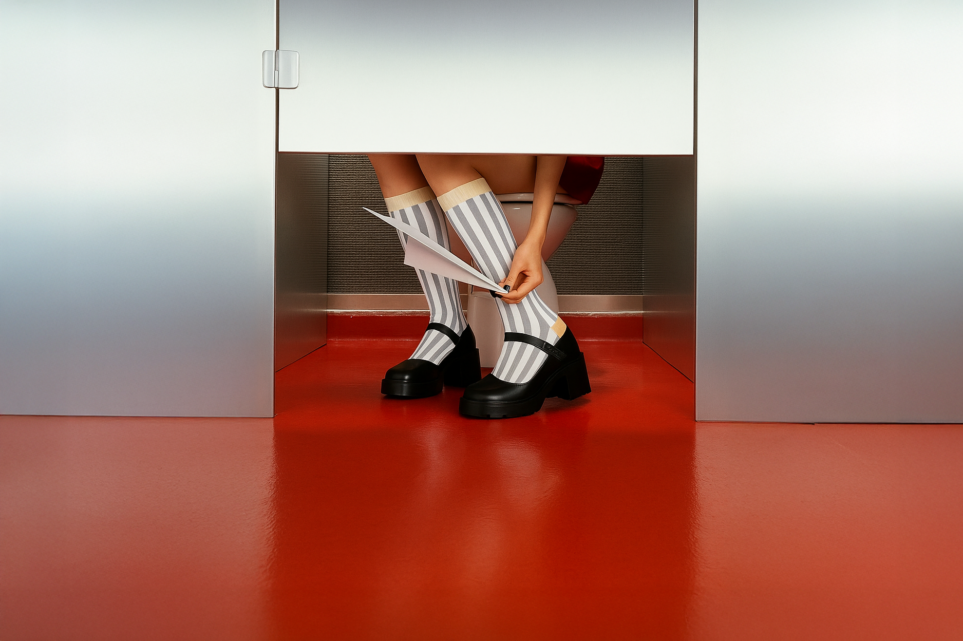
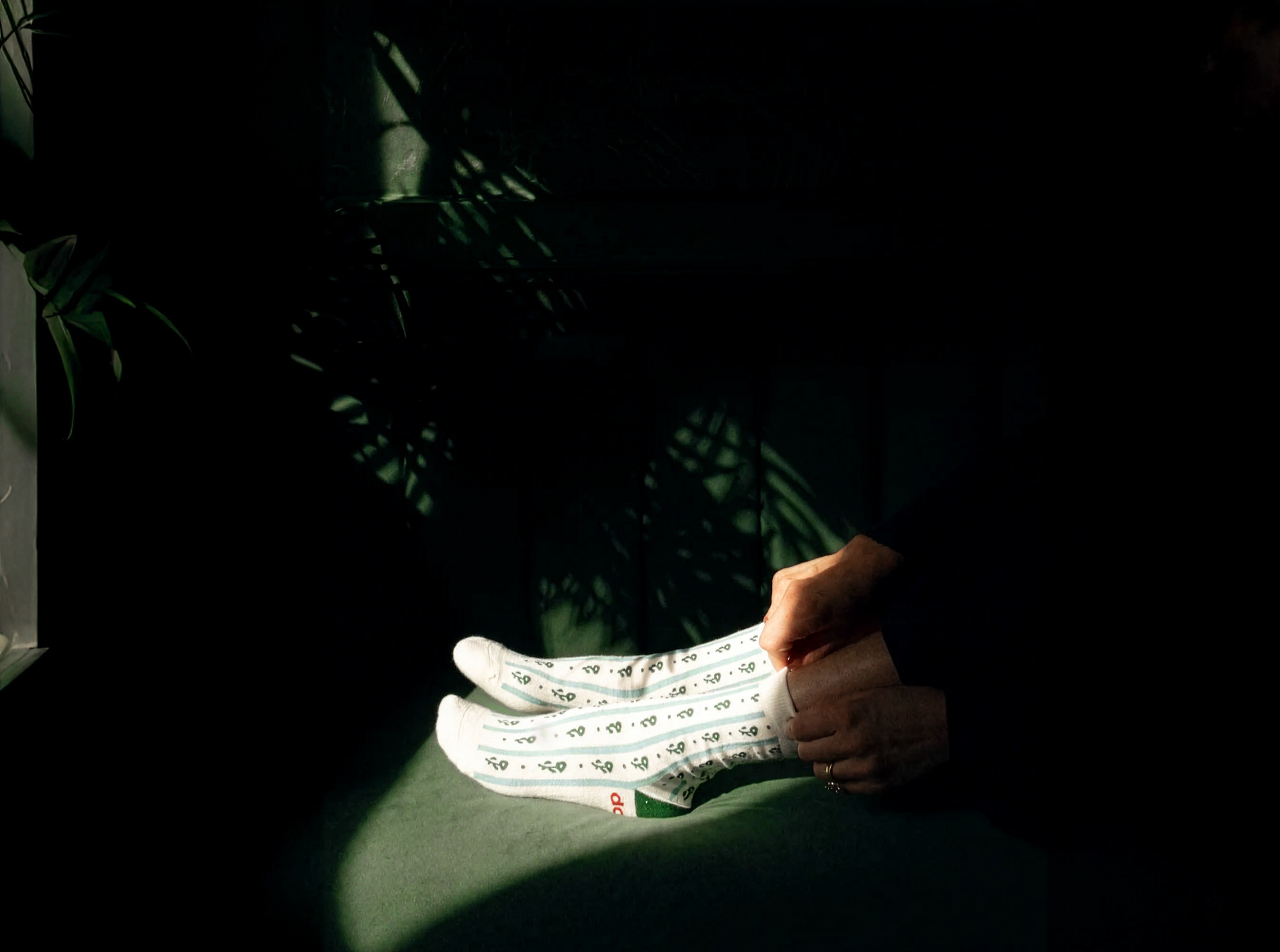
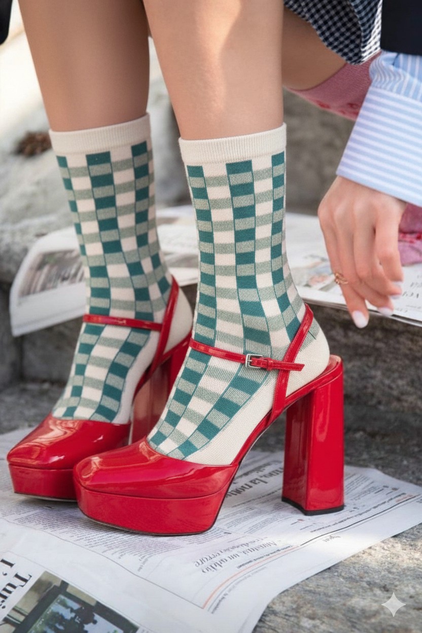
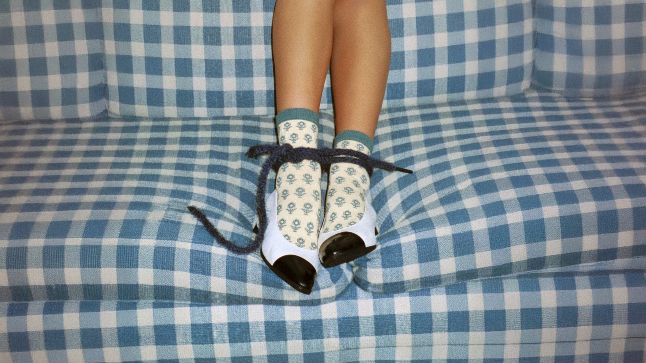
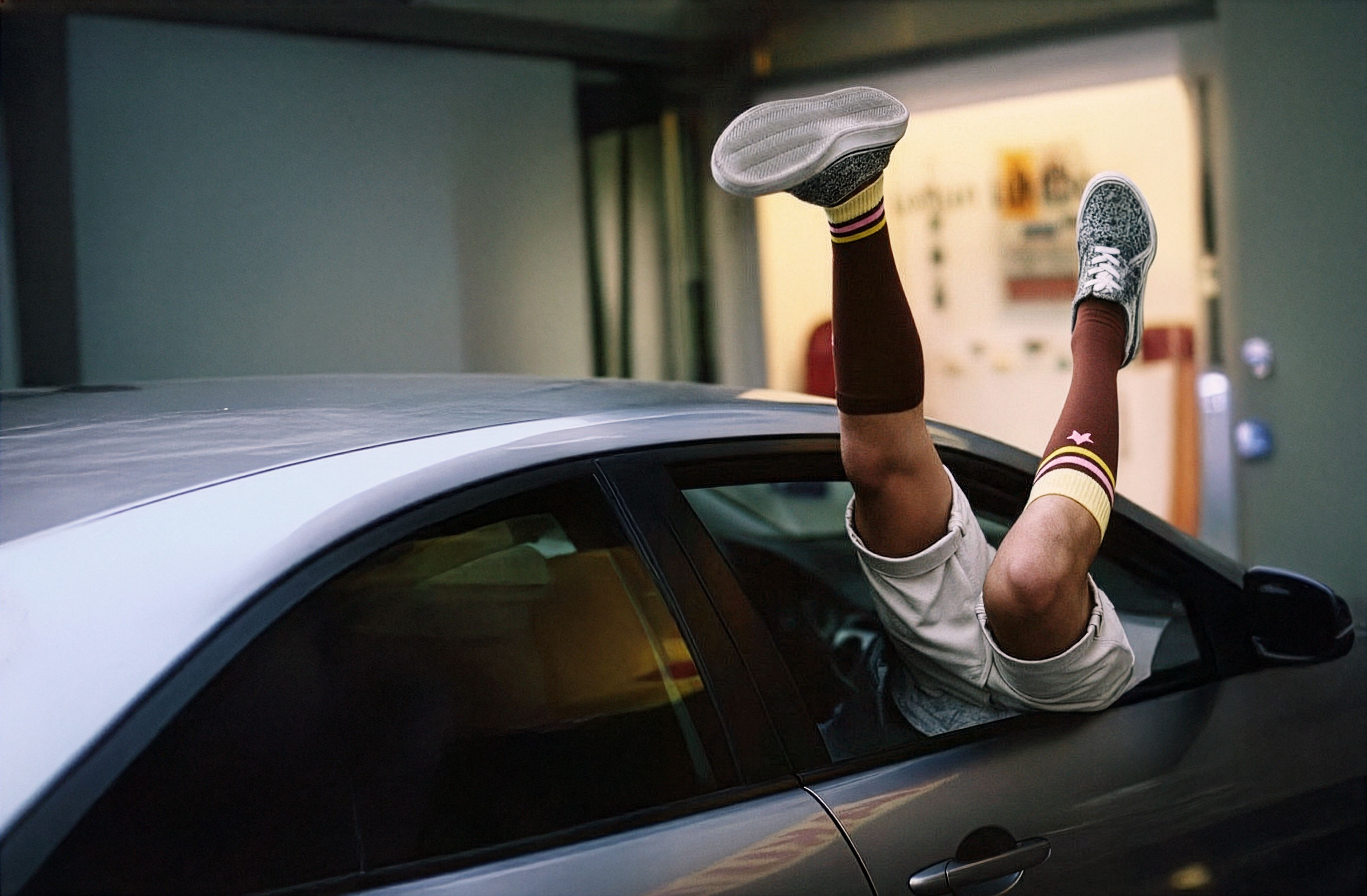
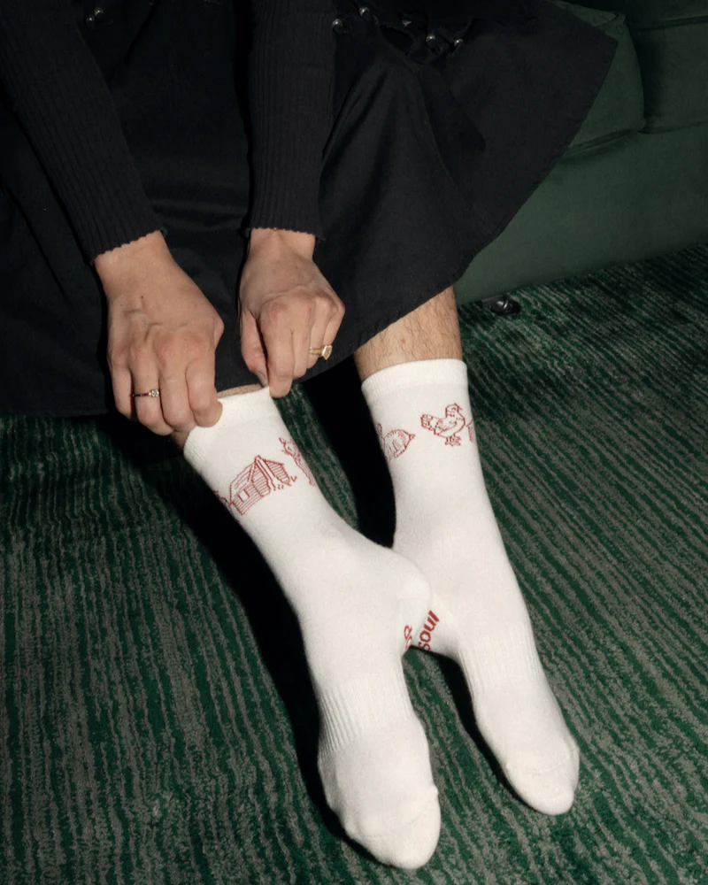
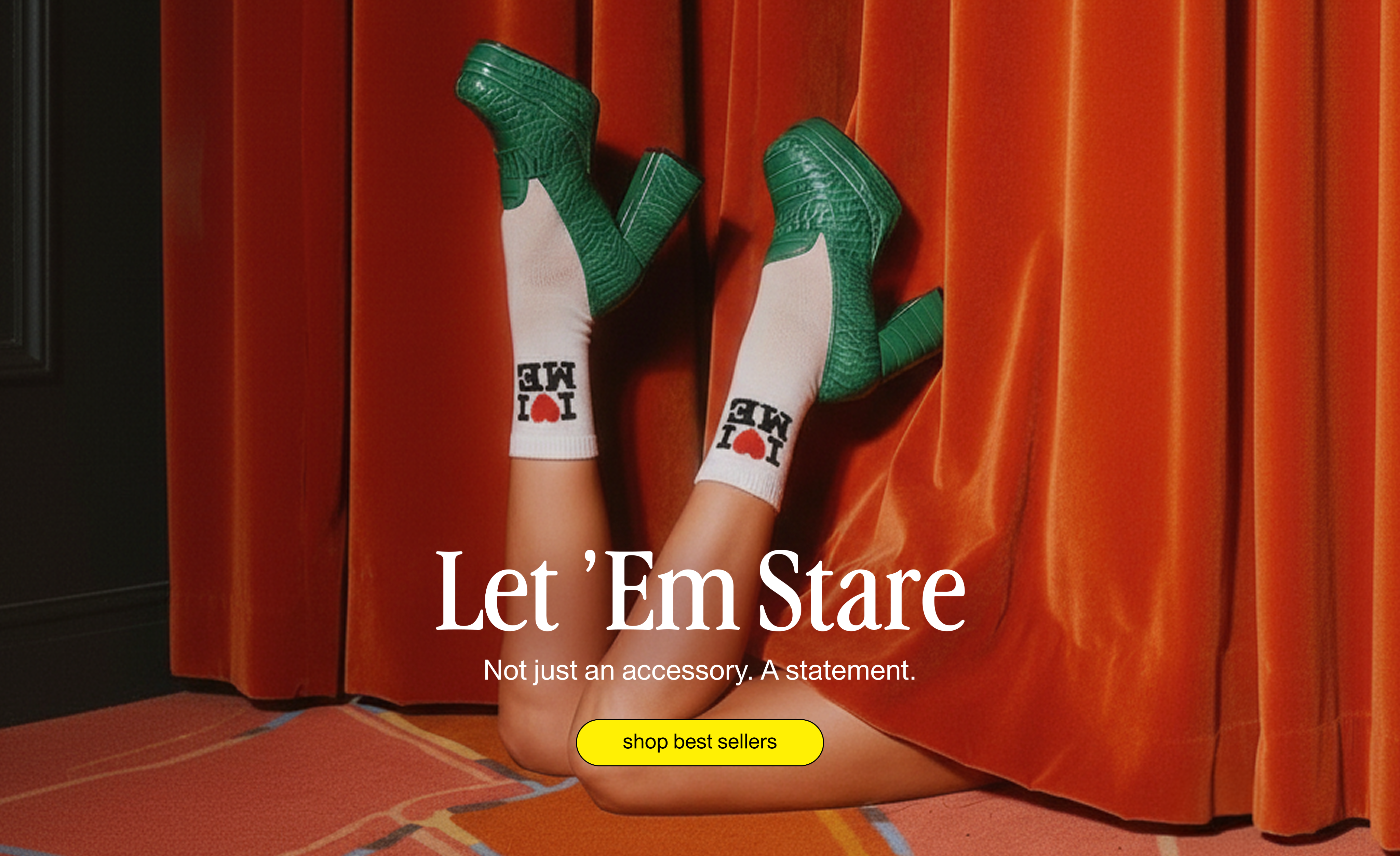
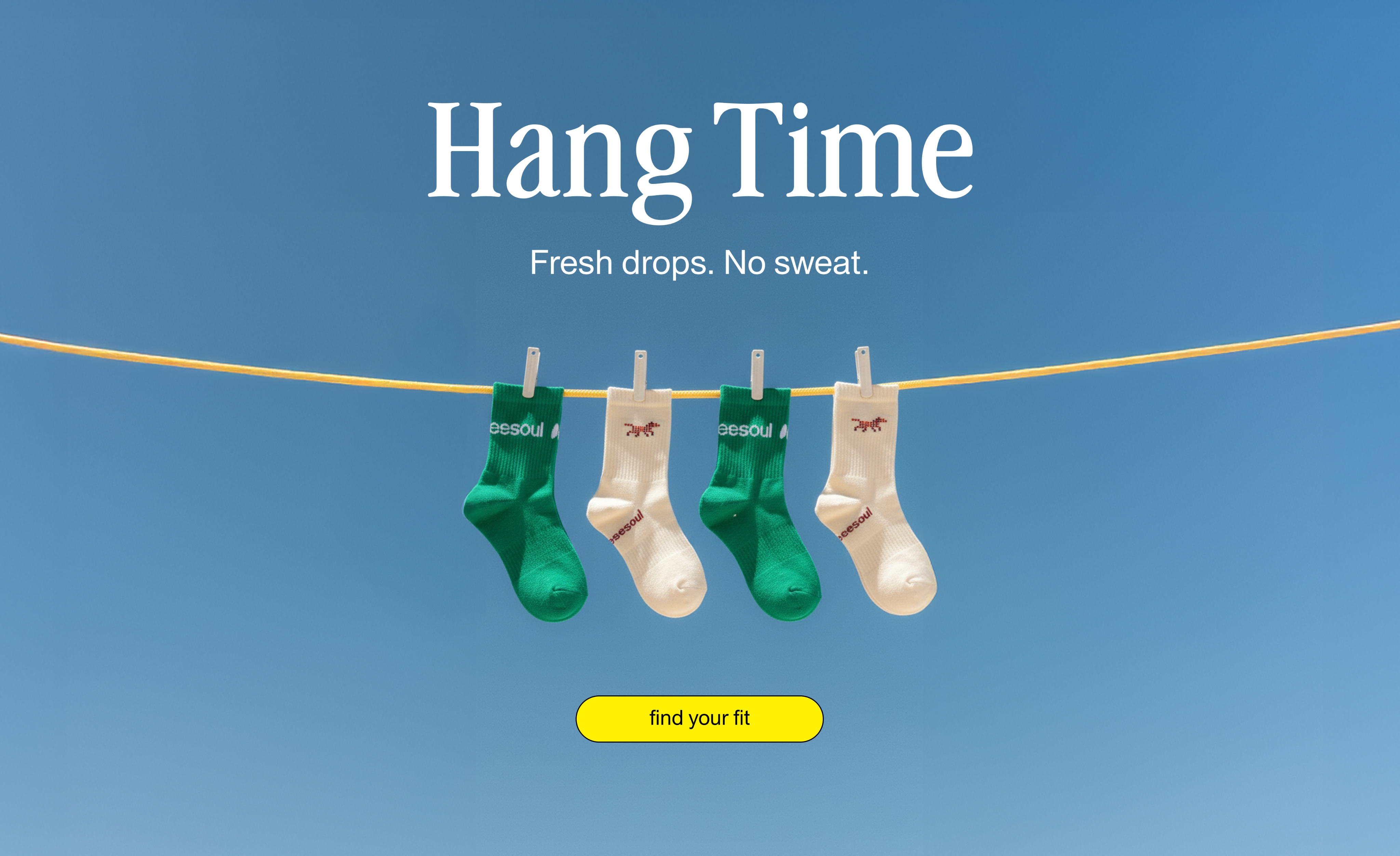
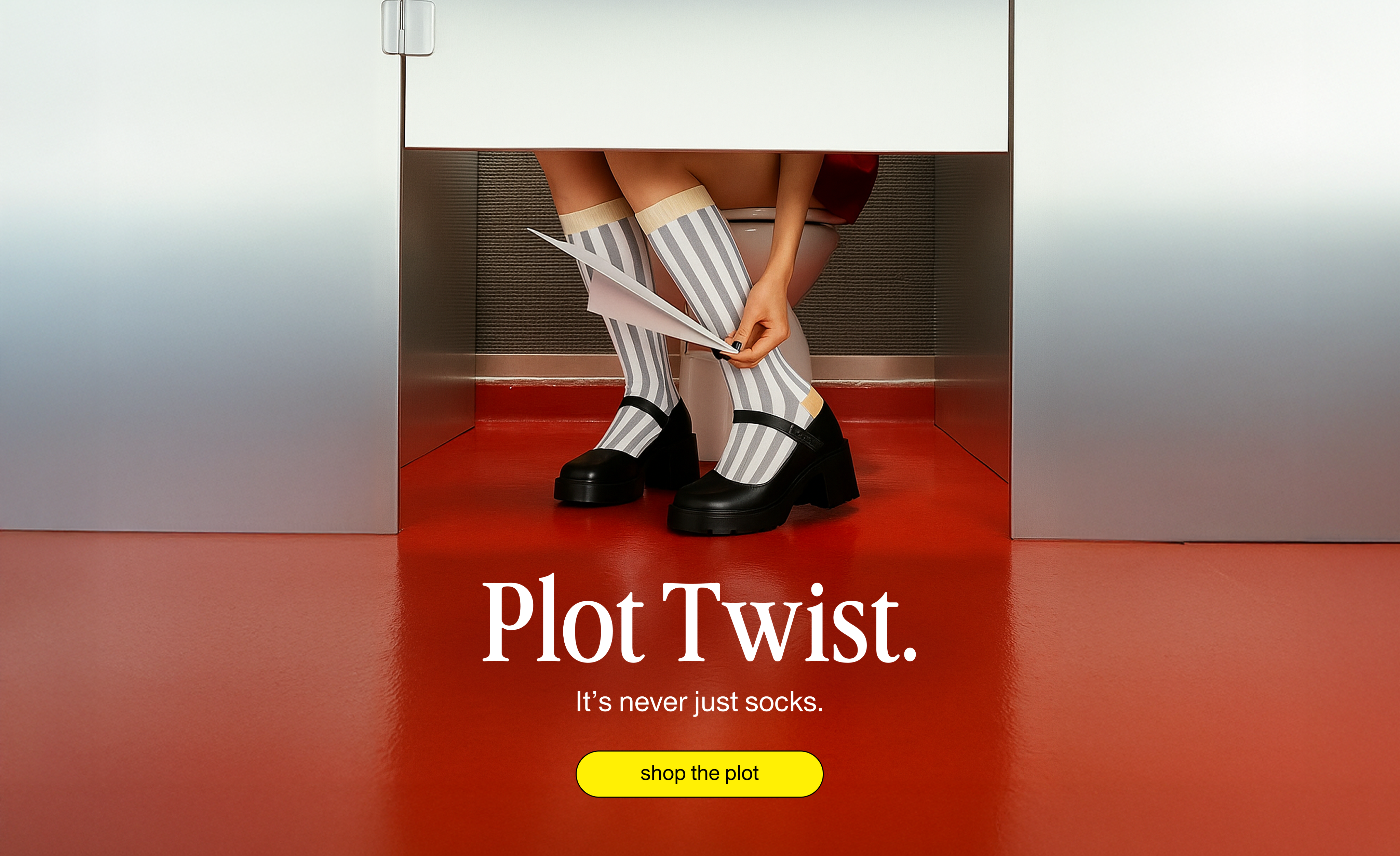
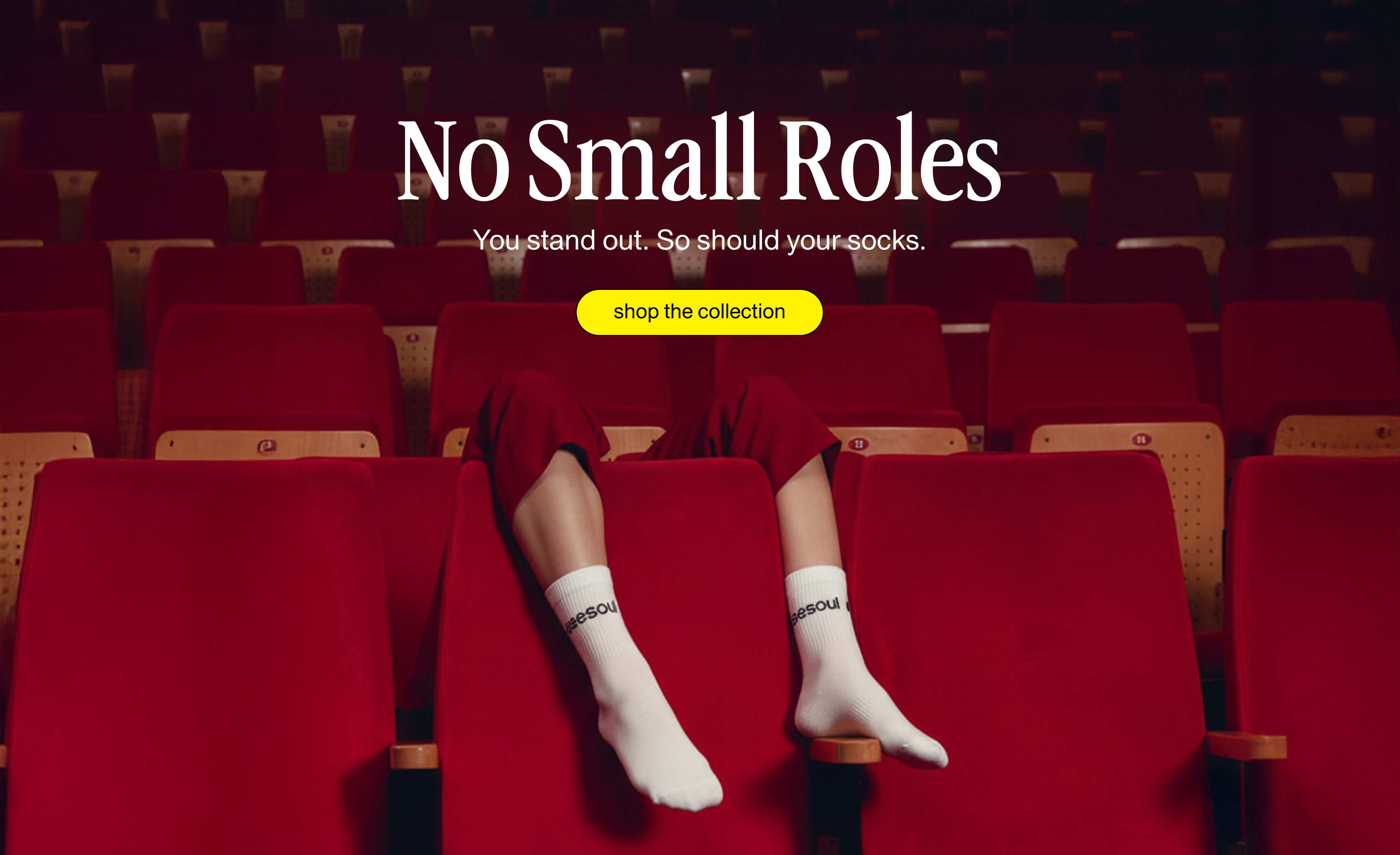
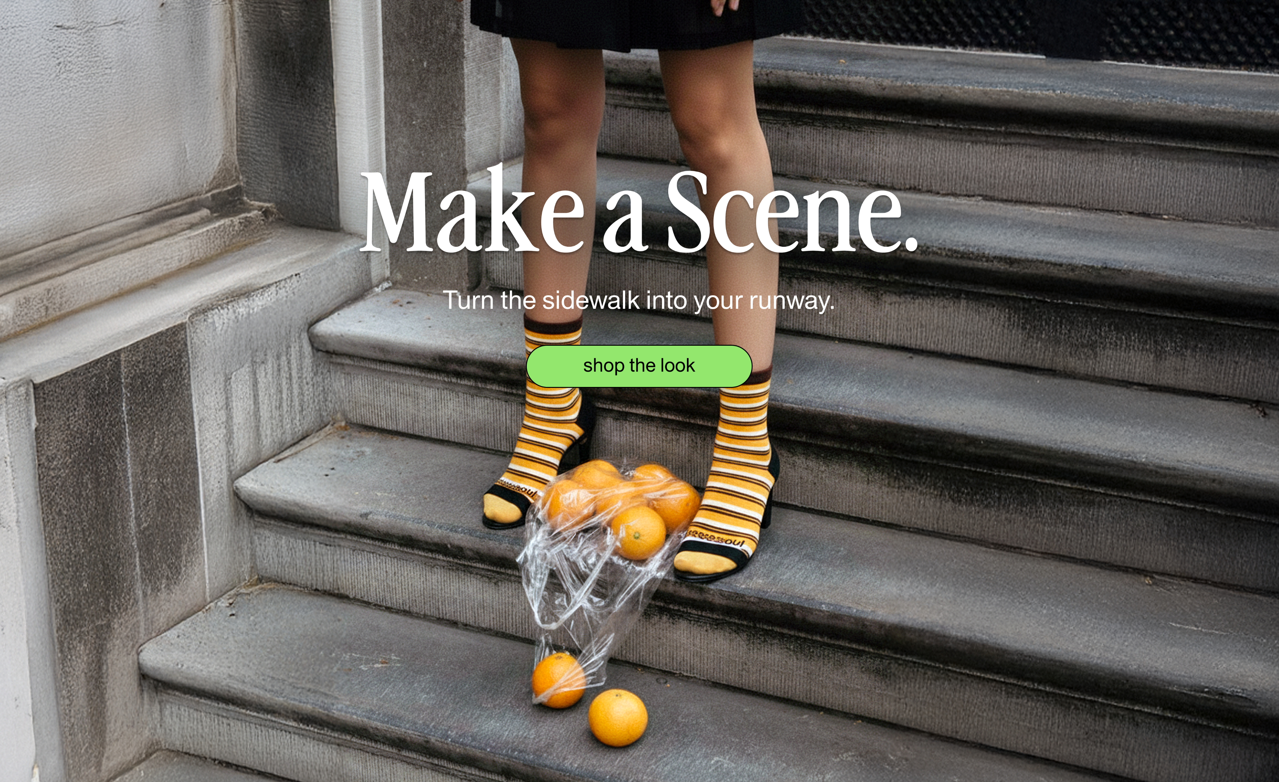
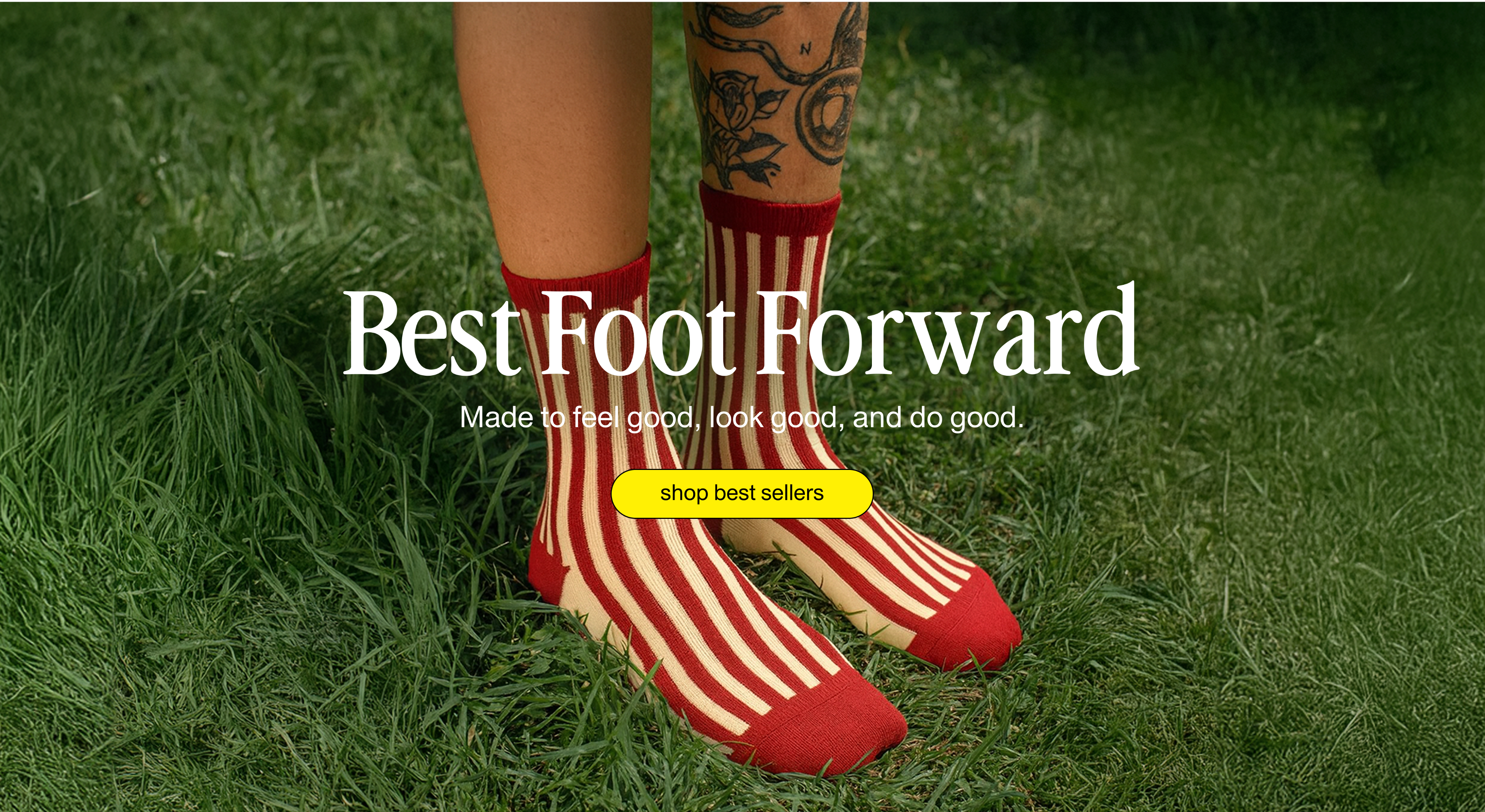
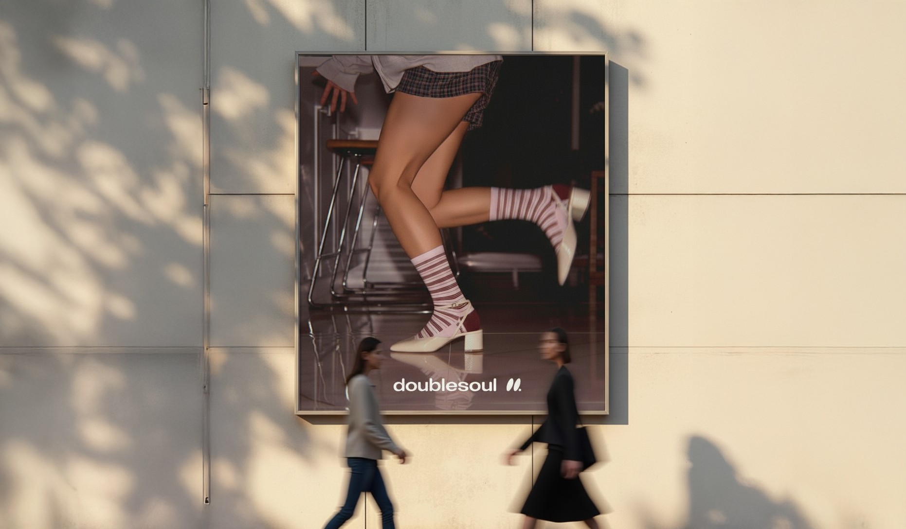
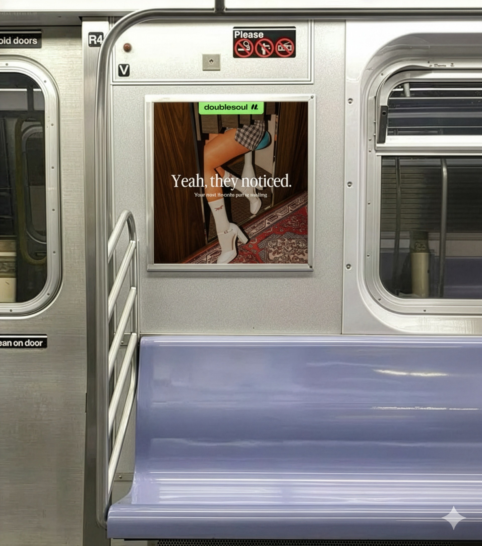
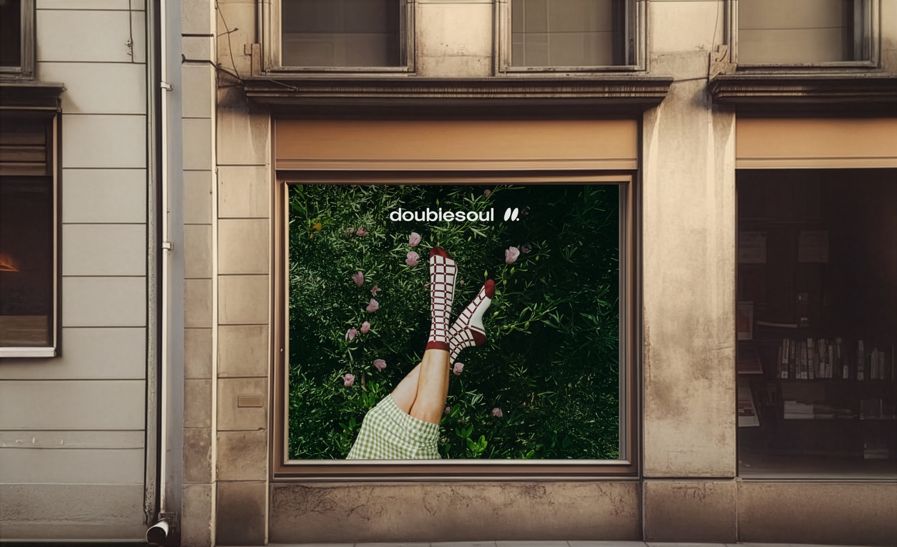
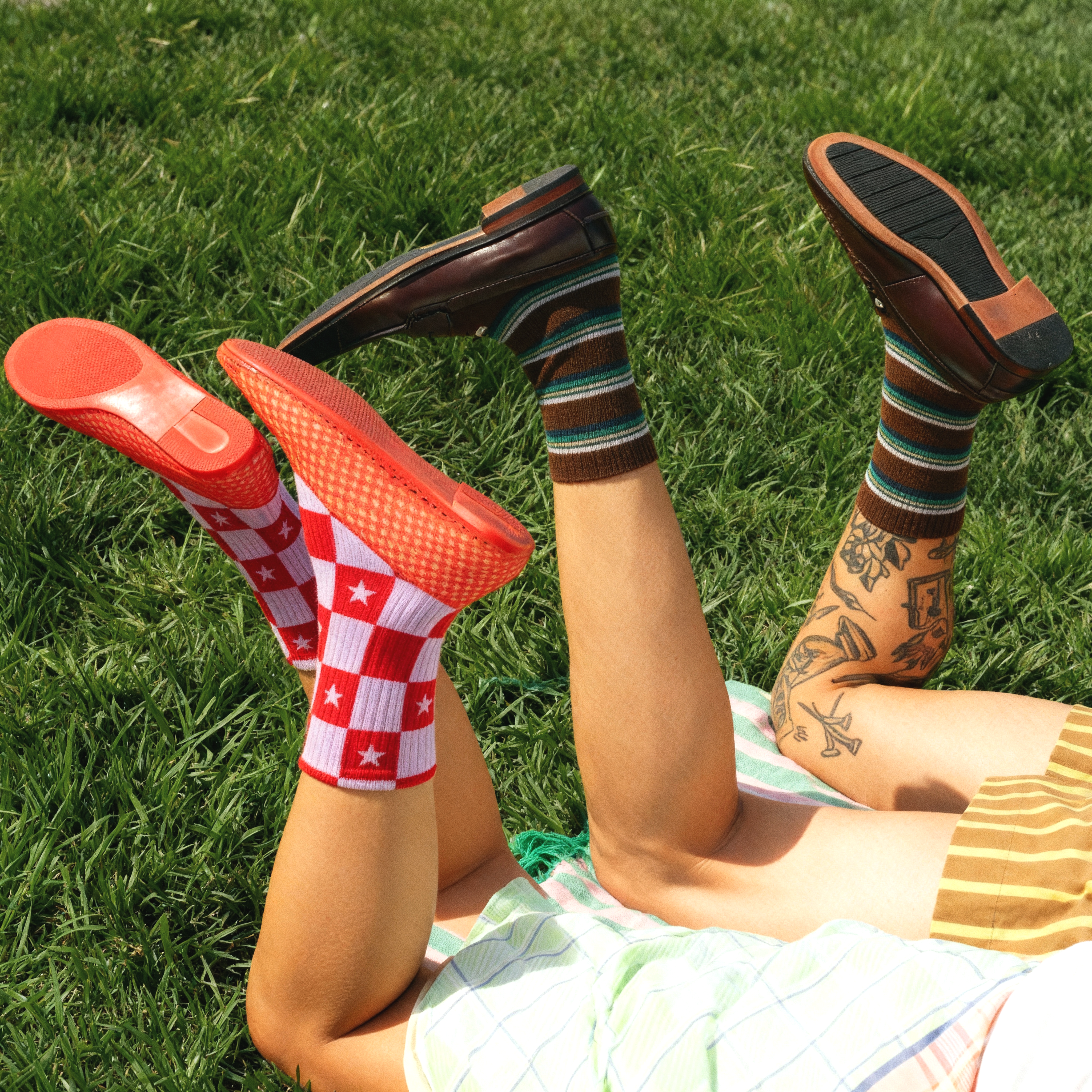
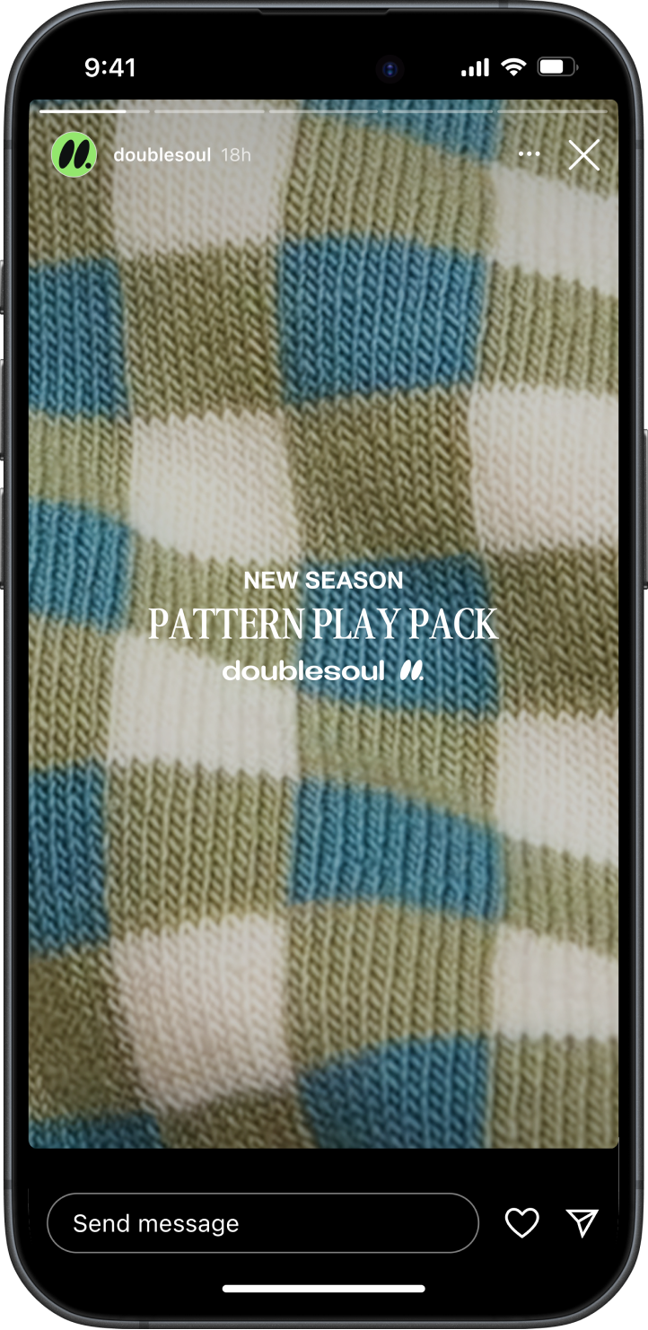
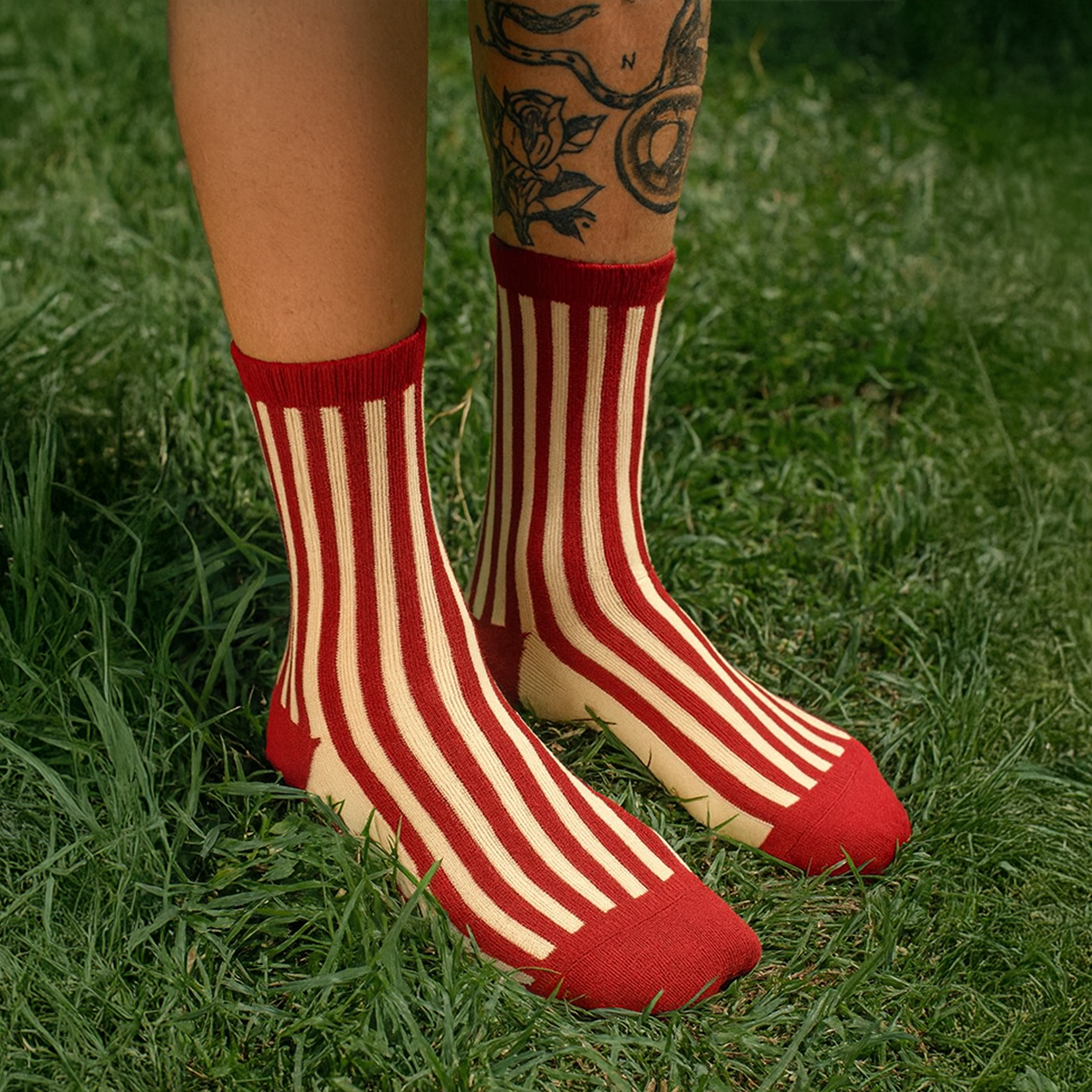
Homepage Hero
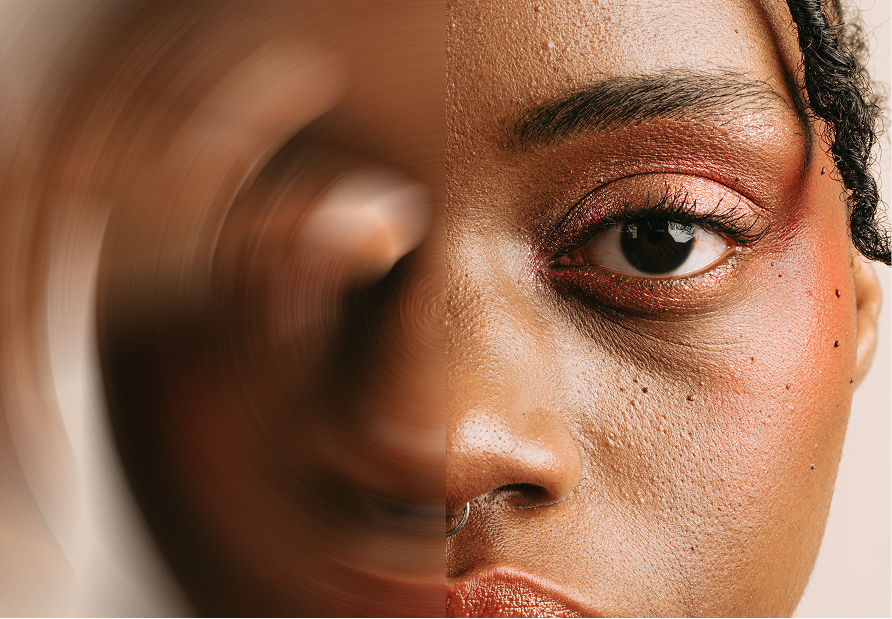
Above the fold is the opening scene. The hero is the handshake. It’s our first line, our first impression, and it’s what people remember.


Approach
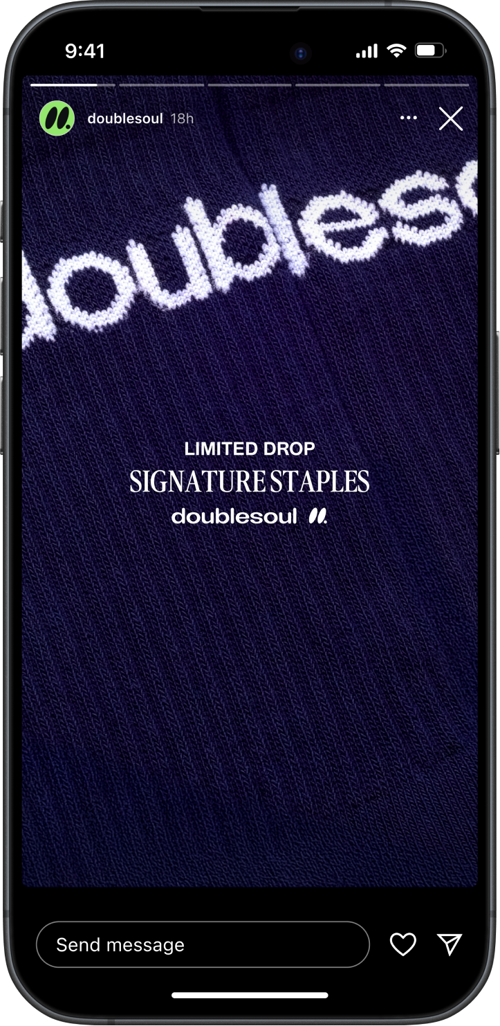
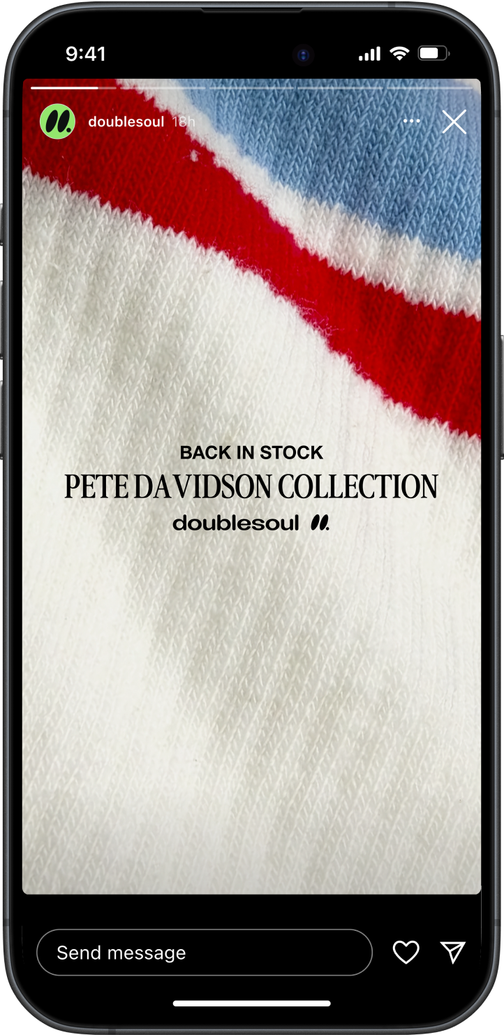
I approached the project by reimagining Doublesoul as a lifestyle brand with design at its core. I concepted and created all of the hero imagery myself, building a world around bold color, texture, and attitude that made the socks feel like fashion statements, not basics. Each image was designed to feel intentional yet effortless — playful compositions, confident lighting, and storytelling details that carried across digital, social, and retail touchpoints. The visual direction leaned into humor, personality, and a sense of movement to give the brand a distinctive, ownable look. The goal was to craft a system that felt elevated but accessible, and to show how thoughtful art direction could turn something as simple as socks into a visual identity worth noticing.
Thank
YOU
More Work


Let’s work together
Back To Top
doublesoul
doublesoul explored an evolution of its visual identity, building on the brand’s bold color and playful tone. Art direction and design elevated everyday socks into confident fashion statements.
Brand Identity, Art Direction • 2025

overview
doublesoul
October 2025
Brand Affinity is How Small Wins Big
SINGLE MOST IMPORTANT THOUGHT
People don’t just wear socks. They wear what they feel.
CHALLENGE
Doublesoul must stand out in a market where socks are often treated as an afterthought and priced for utility, not personality.
CONSUMER INSIGHT
I’m more likely to buy from brands that reflect my style and self-expression. When products feel interchangeable, my choice becomes a statement about me.
STRATEGIC APPROACH
Build affinity by creating emotional connections that turn socks from a basic necessity into a way to express identity.
homepage
hero
1
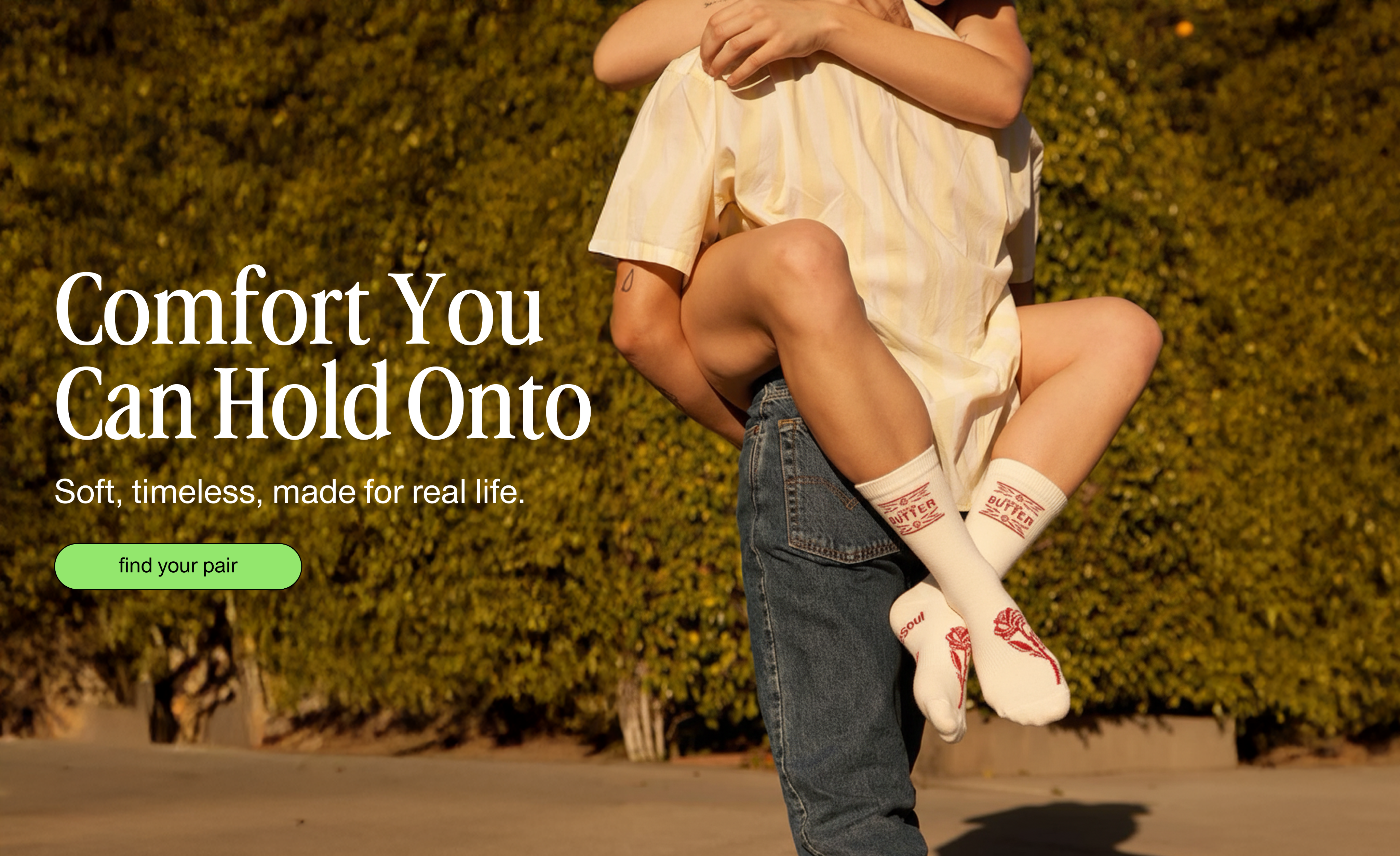
Homepage Hero
Above the fold is the opening scene. The hero is the handshake. It’s our first line, our first impression, and it’s what people remember.
Approach
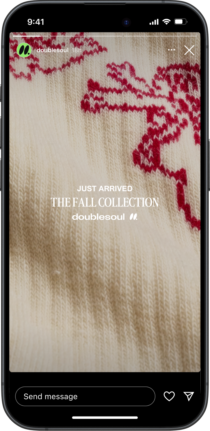
I approached the project by reimagining Doublesoul as a lifestyle brand with design at its core. I concepted and created all of the hero imagery myself, building a world around bold color, texture, and attitude that made the socks feel like fashion statements, not basics. Each image was designed to feel intentional yet effortless — playful compositions, confident lighting, and storytelling details that carried across digital, social, and retail touchpoints. The visual direction leaned into humor, personality, and a sense of movement to give the brand a distinctive, ownable look. The goal was to craft a system that felt elevated but accessible, and to show how thoughtful art direction could turn something as simple as socks into a visual identity worth noticing.
Thank
YOU

doublesoul
doublesoul explored an evolution of its visual identity, building on the brand’s bold color and playful tone. Art direction and design elevated everyday socks into confident fashion statements.
Brand Identity, Art Direction • 2025

overview
doublesoul
October 2025
Brand Affinity is How Small Wins Big
SINGLE MOST IMPORTANT THOUGHT
People don’t just wear socks. They wear what they feel.
CHALLENGE
Doublesoul must stand out in a market where socks are often treated as an afterthought and priced for utility, not personality.
CONSUMER INSIGHT
I’m more likely to buy from brands that reflect my style and self-expression. When products feel interchangeable, my choice becomes a statement about me.
STRATEGIC APPROACH
Build affinity by creating emotional connections that turn socks from a basic necessity into a way to express identity.
homepage
hero
1
Homepage Hero
Above the fold is the opening scene. The hero is the handshake. It’s our first line, our first impression, and it’s what people remember.
Approach
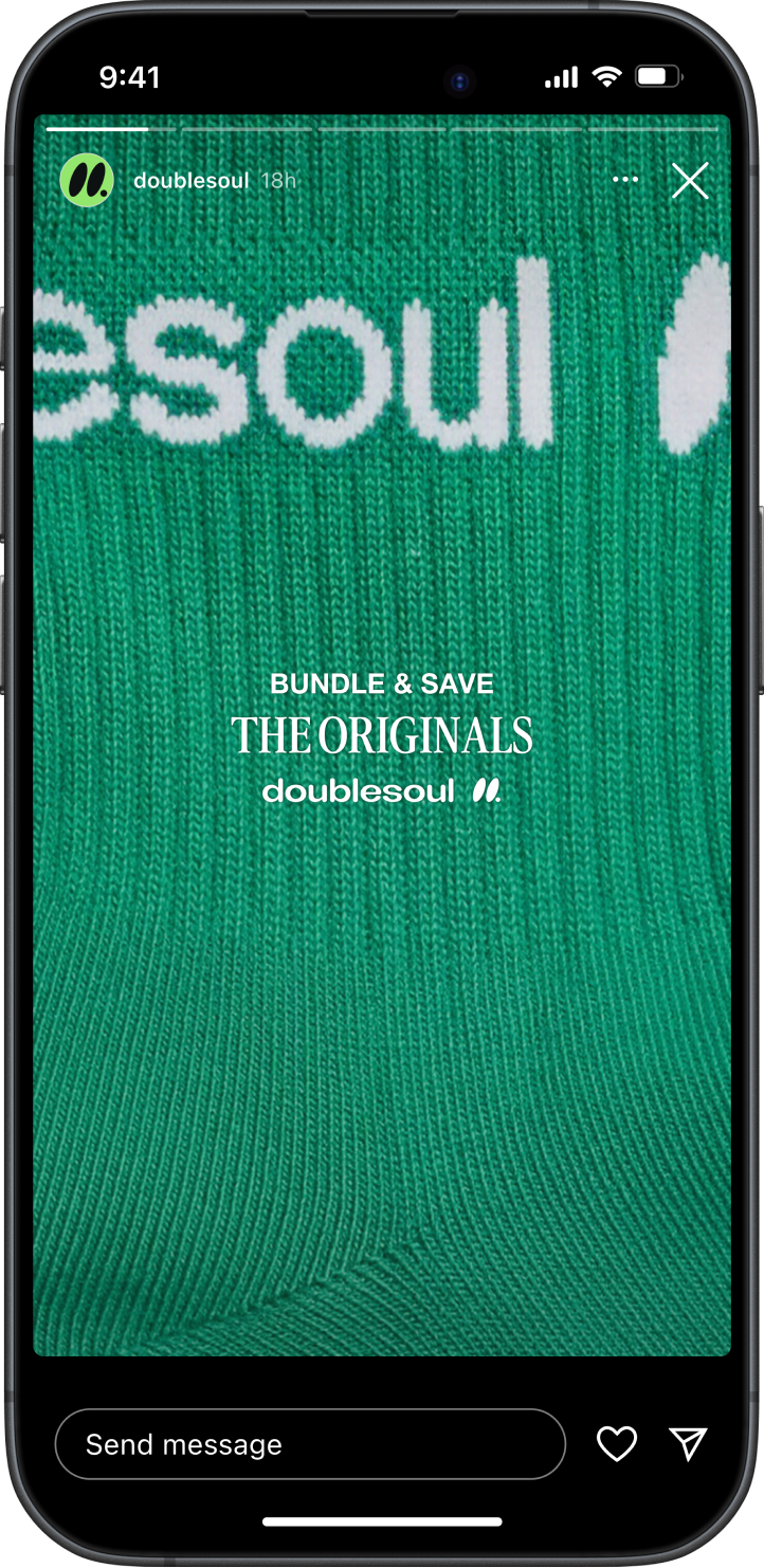
I approached the project by reimagining Doublesoul as a lifestyle brand with design at its core. I concepted and created all of the hero imagery myself, building a world around bold color, texture, and attitude that made the socks feel like fashion statements, not basics. Each image was designed to feel intentional yet effortless — playful compositions, confident lighting, and storytelling details that carried across digital, social, and retail touchpoints. The visual direction leaned into humor, personality, and a sense of movement to give the brand a distinctive, ownable look. The goal was to craft a system that felt elevated but accessible, and to show how thoughtful art direction could turn something as simple as socks into a visual identity worth noticing.
Thank
YOU
Let’s work together
Back To Top